Colours for 2016 – a year of serenity
Pantone are the self styled ‘global authority on color’ and their announcements are taken seriously in the fashion marketplace. The colours of the year for 2016 (there are two of them this year) are rose quartz and serenity. These are likely to be well represented in fashion so having jewellery that matches (whether to wear yourself or to sell) will ensure you’re ahead of the trend.
In this two part blog series, LJS tutor Anna Campbell looks at some inspiration for these trends.
The fashion and interiors industry take the Pantone colour of the year seriously so it is worth being aware of what their research has shown will be key trends in colour this year. Last year saw marsala, a deep red wine colour, as the colour of the year. This year, two colours have been chosen of a more pastel hue – rose quartz and serenity.
Jewellers will be well aware of the colour of rose quartz but what is serenity? Serenity is described as a cool, tranquil blue – think periwinkle or blue chalcedony.

Here are some examples of shades of the serenity colour in jewellery to inspire you

Beautiful blue chalcedony and rose gold earrings from Orsini Fine Jewellery

Gorgeous light blue sapphire engagement ring from Eragem

Aquamarine three strand necklace from Joligem

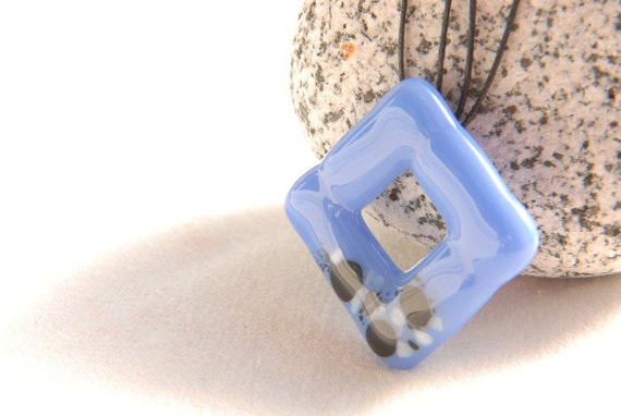
Fused glass square pendant by PannaKotta

Blue chalcedony in a simple but effective wire wrapped design from Silver Wire Designs

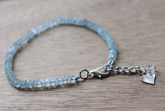
Personalised aquamarine and silver bracelet from Remember Zen

Pale blue enamel earrings by Grace Girvan

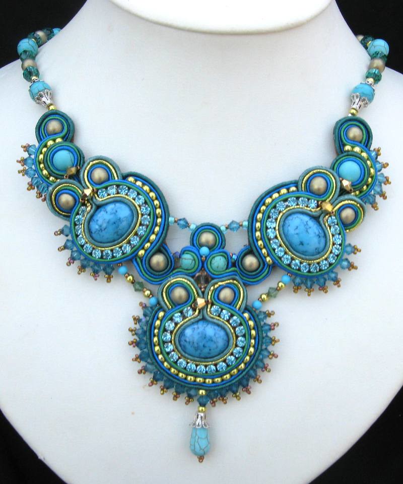
Soutache neck piece by Cielo Design

Enamel earrings by Stacey Bentley
What do you think of the colour of serenity? Will you be using it in your jewellery making? We’d love to see your creations so please share them with us on instagram, twitter or facebook.
Anna Campbell is a metal clay artist and tutor at the London Jewellery School and runs her own jewellery business Campbell Hall Designs.